A look at the Danish artist and designer Bjorn Wiinblad
Today, I thought about digging a little deeper into my parent’s design choices. They don’t change things up a lot and most of the things in their home I grew up with. My parents always loved having their walls filled with artwork and collectibles, some of which I loved and some of which I hated. Recently, I have thought about some of their choices and I have to say I see the specific artist Bjorn Wiinblad mentioned in the headline of this post in a different light. That’s why I researched him a little more. I grew up with Bjørn Wiinblad Rosenthal plates on our dining room wall and I have to admit that I now love them very much as well.
Bjorn Wiinblad: A Look at the Life and Work of the Danish Artist and Designer
This post may contain affiliate links from which I will earn a commission at no extra cost to you. View my full disclosure policy.
Early Life and Education
Bjorn Wiinblad was born on September 20, 1918, in Copenhagen, Denmark. He studied at the Royal Danish Academy of Fine Arts and began his career as a graphic designer and illustrator.
Artistic Style and Mediums
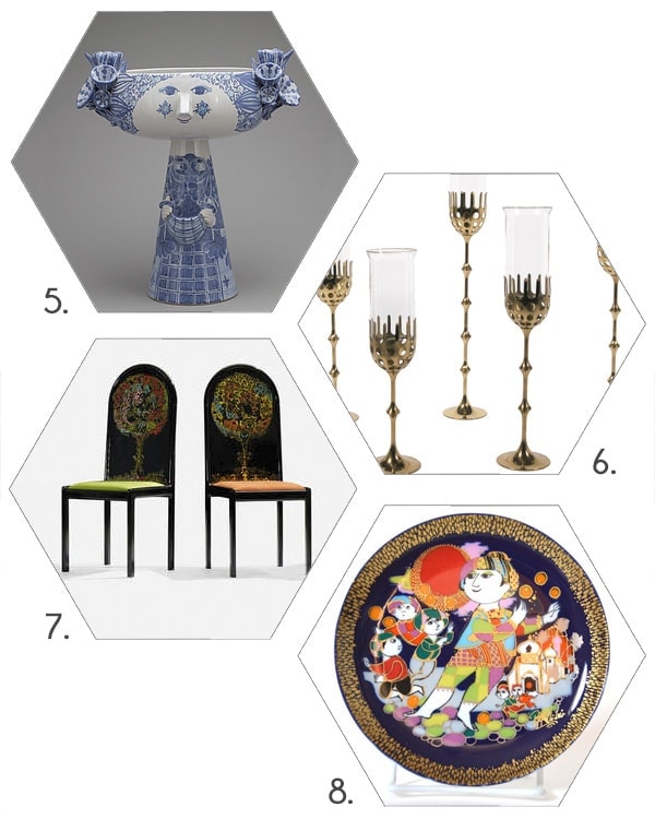
Wiinblad’s work is characterized by bold, sweeping lines, intricate patterns, and whimsical, dreamlike quality. He worked in a variety of mediums, including ceramics, glass, and metalwork. He was also a prolific illustrator and set designer for theater productions.
You can find many beautiful vintage pieces for sale on Etsy. Check them out!

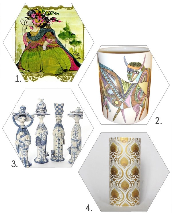
Rosenthal collaboration and other notable works and achievements
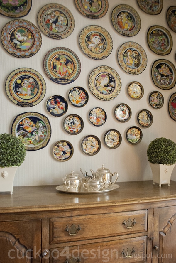
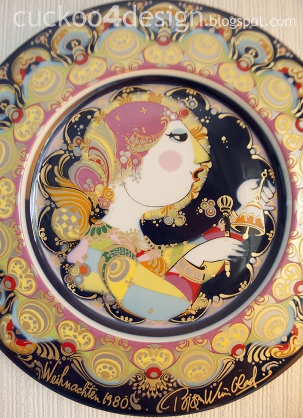
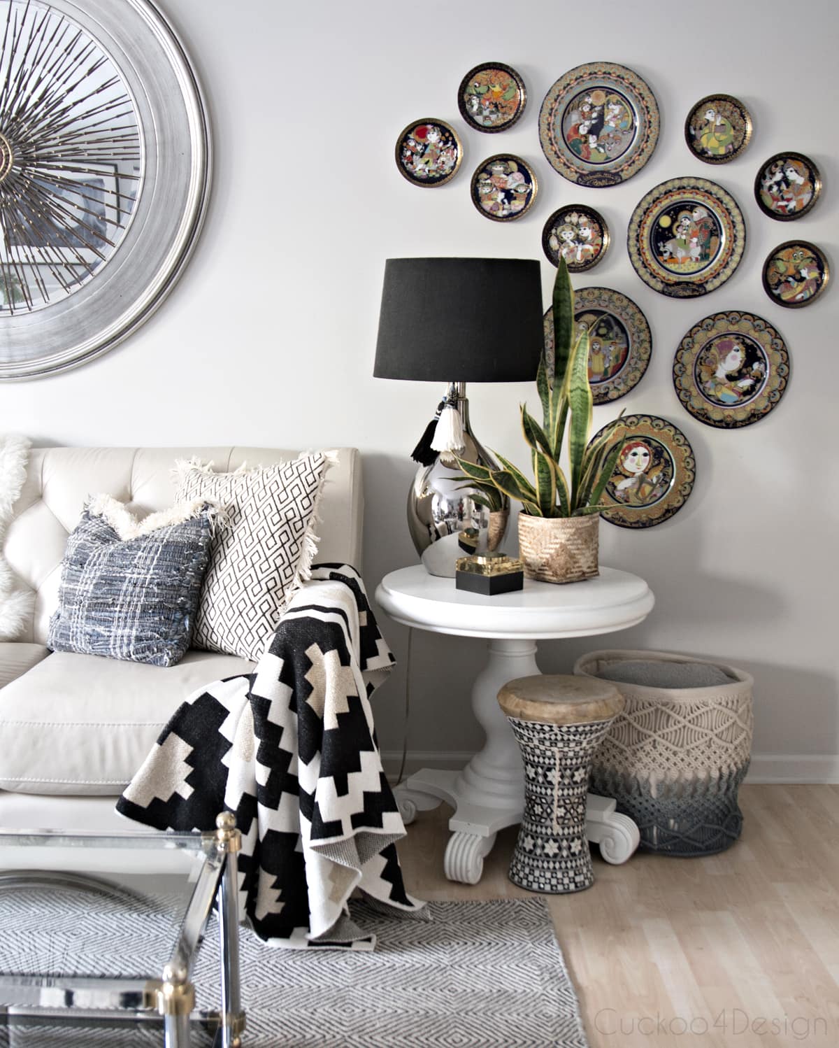
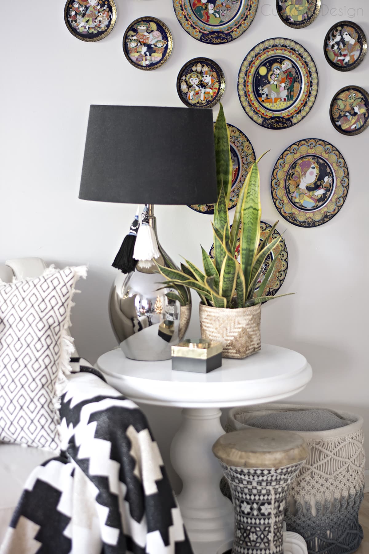
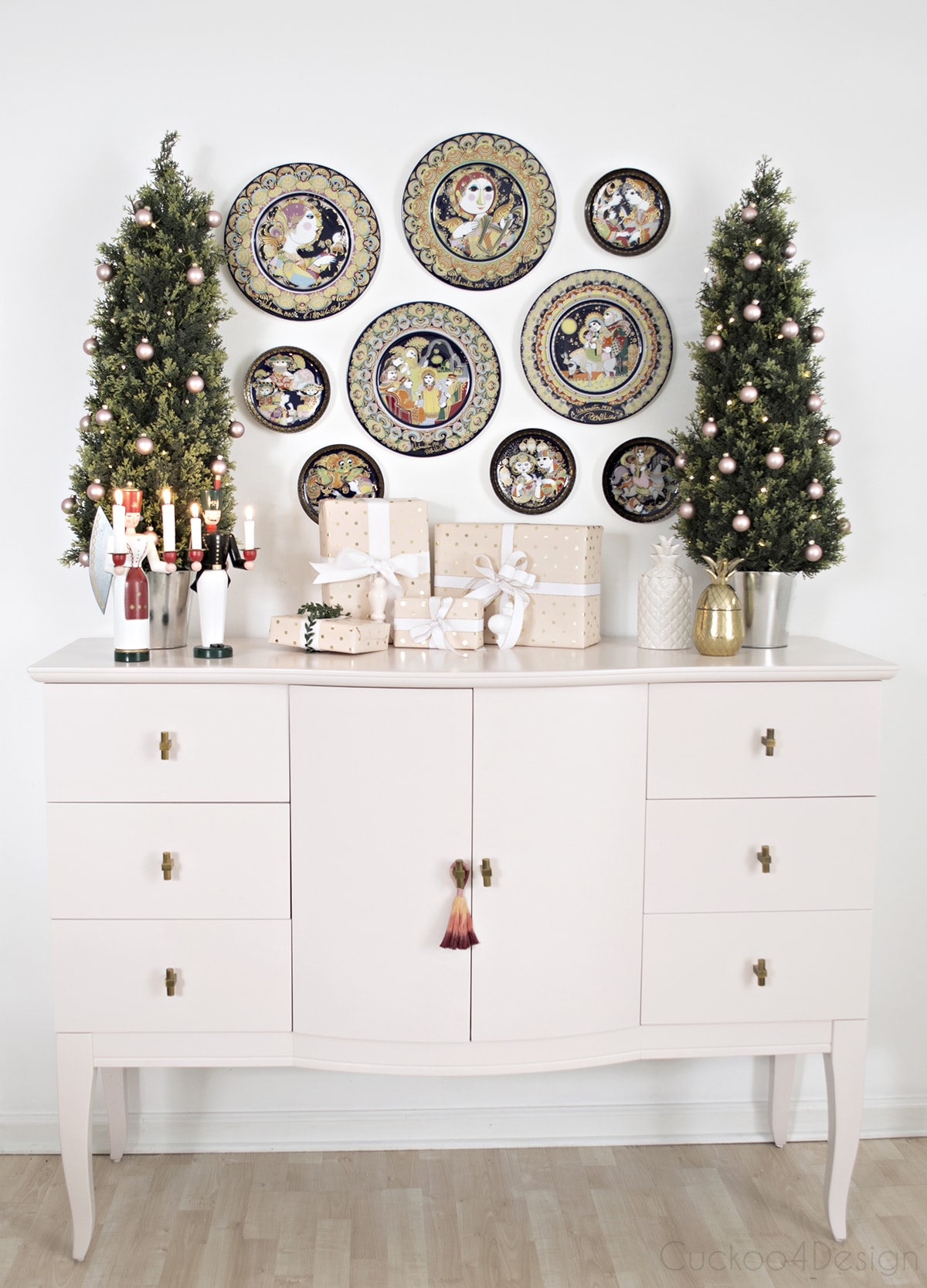
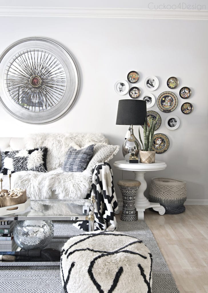
Bjørn Wiinblad is perhaps best known for his collaboration with the German ceramics manufacturer Rosenthal. It began in the 1950s and continued through the 1990s. Wiinblad created a wide variety of designs for Rosenthal, including figurines, vases, and other decorative objects, but it was his series of plates in the 1960s that truly captured the public’s imagination. The plates feature a variety of whimsical, colorful designs that showcase Wiinblad’s signature style. Some plates feature intricate patterns and calligraphic lettering, while others depict fantastical creatures and mythological figures. Each plate is a work of art in its own right, and they are highly collectible today.
One of the things that sets Wiinblad’s Rosenthal plates apart is their size. They are much larger than traditional dinner plates, measuring up to 14 inches in diameter. They are often displayed on walls rather than used for dining. This has made them a popular choice for collectors like my parents who appreciate their artistic value and unique design.
Wiinblad’s Rosenthal plates have been exhibited in museums and galleries around the world. They remain highly sought after by collectors today.
Wiinblad was also a prolific illustrator and designer of theater sets and costumes. He designed sets for several productions at the Royal Danish Theater in Copenhagen, including a production of Mozart’s “The Magic Flute” that was performed more than 400 times over several decades.
Legacy and Impact
Today, Wiinblad’s designs remain highly sought-after by collectors and enthusiasts, and his work is featured in several museum collections around the world, including the National Museum of Denmark, the Museum of Arts and Design in New York, and the Victoria and Albert Museum in London.
He remains an icon of the 20th-century art world. His bold, whimsical style and innovative use of color and pattern continue to inspire and captivate audiences today.
Bjorn Wiinblad’s designs in the modern design world
Bjorn Wiinblad‘s designs remain popular and influential amongst interior designers and in the design world as well. There are many contemporary designers who draw inspiration from his work or incorporate his pieces into their own designs. Here are a few examples:
- Danish design brand Tine K Home features several Bjørn Wiinblad pieces in their collection, including a series of plates, vases, and candleholders that feature Wiinblad’s distinctive patterns and calligraphic lettering.
- The British designer/artist Matthew Williamson has cited Wiinblad as an influence on his work, particularly in his use of bold, colorful patterns and his love of exotic motifs.
- Dutch designer Marcel Wanders has created several collections of home decor and furniture that draw on Wiinblad’s whimsical style and use of pattern and color. One of his collections for Italian design brand Alessi, called “Dressed in Wood,” features a series of wooden trays and containers adorned with Wiinblad’s signature patterns and illustrations.
- One of my favorite American designers Jonathan Adler has also been influenced by Wiinblad’s work, particularly in his use of vibrant color and playful, irreverent motifs. Adler has created a number of ceramics and home decor items that pay homage to Wiinblad’s legacy.
These are just a few examples of the many contemporary designers who have been inspired by Bjørn Wiinblad’s work.
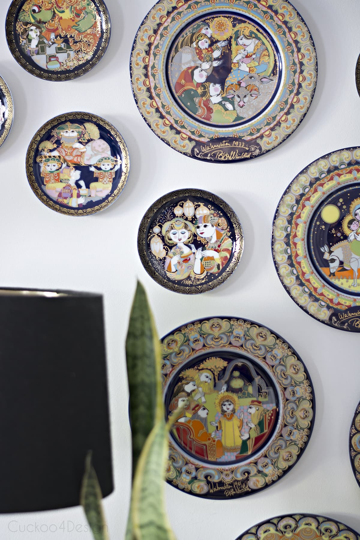
Bjorn Wiinblad plates in my own home
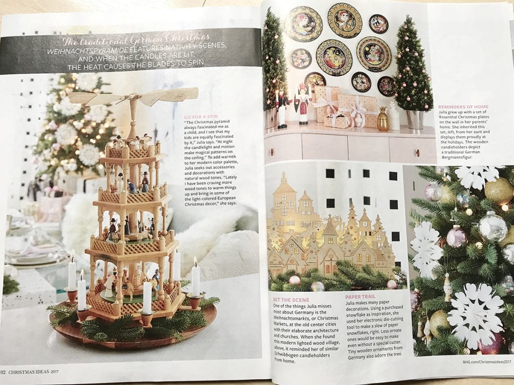
A while back I used the plates for my German Christmas home tour and in the recent Better Homes and Gardens Christmas Ideas feature. Let me show you.
I love collecting vintage and antique items for our home. Check out my blog posts about Piero Fornasetti, Curtis Jere wall sculptures, how to decorate with family heirlooms, and also how to make a reproduction oil painting.
Do you have any design trends or choices that you grew up with and that you are finally learning to like? Or should I say that stir warm memories?
Tschüß,

Those plates are very interesting. Love how your parents displayed them, but I really like how you modernized the look. Cool post. Thanks!
I think they are interesting now too. Took me only 38 years to start thinking about them a little, LOL
I love the display with the antique sideboard, beautiful colors. I grew up in the 80’s and 90’s, not the best time for design choices! All I remember is country blue and hearts and geese! 🙂
Wow, the 80s and 90s looked completely different in Germany! LOL no geese or hearts but my parents always like blue. I grew up with the blue velvet couch that I want so badly now.
Your parents collection is unbelievably beautiful. A Treasure!
Your version demonstrates how true artistry carries through the generations.
Thanks Patty and my mom doesn’t like my version at all 🙂
Those plates are amazing….quirky and cool! I love how you’d display them! Mixing modern and vintage/antique is just the best.
Well, like I said already, my mom doesn’t like my version: too colorful 😉
Wow, that is some seriously interesting art. Very original and beautiful. Some of is almost turkish looking with all the gold tapestry-ish feel to it. And the gold vase is GORGEOUS.
You really do have great taste Julia.
Annie XO
p.s. I added you to my blogroll to spread the word about your blog!
it’s very nice how they have displayed the plates (the plates are beautiful, the colors are amazing) and how it’s just above their antique sideboard, I guess your parents knew how to decorate even back then when this trend hadn’t started yet 🙂
My parents like old European dutch style, I guess that’s what I could call it! My mom would change a lot but my dad hates change!
WOW I’m really impressed with these plates actually! They’re so interesting, and I love how they’re displayed. Not to mention the fact your parents are so on trend 🙂
WOW! such an awesome collection! those are fabulous and i could see them in your space like that, too!
Those are incredible ~ I love them with their buffet! And, that vase…yes please! I used that West Elm rug recently for a client, it is so cool!
What an interesting post! To hear about the history of artwork in your family was great! Makes me want to do some research of my own! Thanks for sharing.
I love both displays. I know I love that side table of your parents. But I love the yellow table with the plates. I think it brings out their vivid colors.
I love the way your mom and dad display their plates. Their sideboard is gorgeous as well.
Your parents have great taste. (I’m loving the work of this artist!)
What a wonderful display your parents have. I had to stop on this post first of course 🙂 I love your re-imagining with the yellow hutch and blue rug. Perfect!
It’s great to find sooemne so on the ball