Backsplash Options
First of all is it just me or do any of you other mom’s think school portraits are ugly? While I, of course, do get my kids year book portrait every year, they also have spring pictures every year and I have been refusing to get them done. I have even written to the photography company to ask them to stop putting the kids in front of hideous backgrounds. The fake gardens, fake porches and fake brick walls are just not doing it for me. But it must be just me since my son was the only one in his class not taking any photos. I take lots of pictures of my kids during the year and they turn out way better than anything the photographers do at school. Now, tell me does anybody share this dislike for the school photography companies? And the prices are complete ripoffs too! I wish I would have a picture to show you but the papers went straight into the garbage
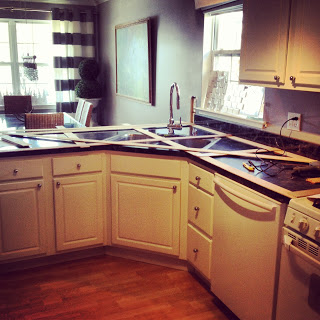
Well anyway, I’m seeing the light at the end of the tunnel, the kitchen tunnel! I moved the outlets from the half wall, switched out all the old beige electrical outlets to white, patched up the hole in the wall.
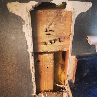 |
| If you follow me on Instagram, then you have seen these photos already. |
Now I’m somewhat undecided on what to do with the backsplash. The window in the kitchen makes it a little difficult. That is exactly the reason why I have never placed tile in the kitchen before. I liked the plain look of the painted wall. This time I want to get away from the 4″ backsplash though and have something different.
I’m pretty sure that I want to go with honed carrara marble subway tiles, since I wasn’t able to use the marble as a countertop. Or lets say I was too scared to use it as a countertop. Using it as a backsplash would still allow me to have it in the kitchen anyway.
I want to share some different options with you. Now pardon me but the pictures aren’t my best photoshop work, but I was simply to lazy to cut around the faucet and fix some other things. I’m sure that I get my point across anyway, right?
This is what I’m thinking and YES THE BACKSPLASH GOES ALL THE WAY THE LENGTH OF THE COUNTERTOP, which it might not look like in the photo:
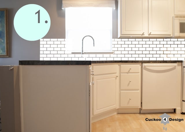 |
| subway tile all the way through |
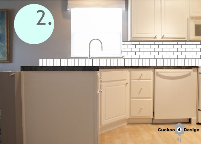 |
| subway tile standing up under the window |
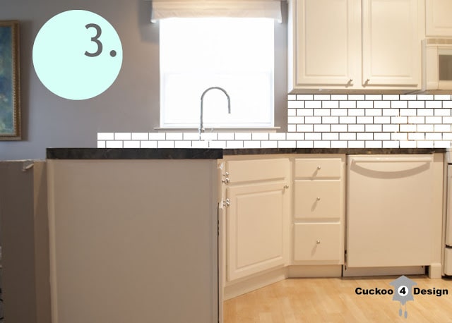 |
| subway tile cut off at cabinet |
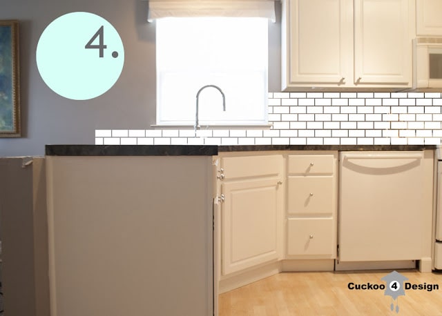 |
| subway tile to the window |
Centsational Girl had option 2 in her post “Spicing up Subway tile” and I kind of really like it. It would be perfect to run under the window.
My least favorite is option 1, because it would take a lot of wall space from our dining area and I feel like it would dwarf the space. I also don’t like the corner sticking out like that. But it does look more symmetrical, doesn’t it?
Here are the before posts (click here and here) with the wall just as a reminder.
Now this might all look different when the countertop is finally installed but for now, what do you think?
Which one is your favorite? Or do you have any other ideas? Please do share!
I wish you all a great weekend.

(Youleeya)


ok, maybe i am a moron but i don’t see the difference in the image in 3 and 4…. but if i am reading right, i think the image of 3 might be going too far and i like the idea of 3 better than 4- i hope that makes sense! just trying to figure out what you mean since the pic looks the same!
and i am with you- i don’t order spring pics and i think it is just a ploy for us to spend more money. i NEVER hang school pics- i don’t like them either. i like the more natural pictures!
You are not a moron LOL, they are almost the same. In pic 3 the tile doesn’t go all the way over to the window but cuts off at the kitchen cabinet and in 4 the tile runs all the way over to the window. Small difference.
Thank God I’m not the only one who hates the school pictures.
I like #4 but #5 could be running the white tile all the way up around the window. Glad you are making the decision! Ha!
ANd it’s a hard decision 😉
1. I hate school pics and don’t hang them – EVER. The grandparents like them, so we do get a few. But I much prefer the photos I take that are more ‘them’.
2. I like option 2 and 3. I really prefer the tile stopping at the cabinet edge, to me it makes the window feel more balanced. Running the bottom row vertical is a fun twist. BUT, if you are thinking about resale I would stick with the all horizontal – most people don’t appreciate these details. I sure wish more people did…
I never hang them either 😉
And you might be right about the resale issue.
Wow, good gravy! What a dilemma! My eye rests with symmetrical details. I might be the only one, but #1 gives me more of this feeling than the others. With the ledge gone the back splash would go the length of the counter top. For a different approach I might look at #1 with #2. What will the counter top be? (I am a new follower, and missed that detail!)
I am a Grandparent and I HATE school pictures…..I hated them when I was a parent and the package was sent out. I never ordered any!
My eye rests with symmetrical detail too. I guess I’ll have to wait for the counter to be in and then see what I’ll do.
I can’t wait to see what you do with it! I love the idea of marble subway tiles!
Me too!
I hate to say it but I think # 1 is the best option. To me, it’s the most visually pleasing. The others feel more off balance. Which, is not always a bad thing. I agree with Jill Frank and think you should lay them all horizontally. Unless you plan on going for the higher backsplash on the end. Then you could have one row vertical and then six horizontal above. That would be a nice way to break things up visually. Can’t wait to see what you decide!!
I know it’s visually pleasing 🙁 It totally is.
I love the new kitchen 🙂
Come and visit me and maybe we can follow each other:)
http://www.olivains.com
Thanks Oliva!
I am a new follower and I am loving option #1! I think the fact that it is all symmetrical is key and I almost feel like it gives the appearance of (at least in the pic) a larger area…everyone likes large kitchens, right? I’m excited to see which you choose! I also love love love your Fornasetti Plates. Last year, my hubby and I stayed at Cosmopolitan in Vegas and the Fornasetti Face Wallpaper was in our closet…we LOVED it! I was trying to come up with a way to get the Fornasetti look in our house without the price tag! So happy to have found your blog! Jesse @ Scout & Nimble
Yes everyone loves big kitchens, true!
I’m glad you like the plates. I love them too! Did you end up buying the stickers?
I’m a new email follower to your blog as well 🙂
I will add a professional opinion…I am a kitchen designer. I have been faced with this window/peninsula situation before, and I always design the backsplash like option #1…it keeps everything balanced around the window. But you could incorporate the soldier row (row of tiles set vertically) like in option 2 if you like that look. I would also recommend adding a piece of art, small decorative shelves, of SOMETHING on the wall to the left of the window to balance out the wall cabinets on the right. But the last thing I always tell my clients is that there are no rules, just guidelines…it’s your kitchen, and you’re the one living there, so do what you like! 🙂
Thanks Jill for stopping by! I think I’ll have to take a picture of a different view next time so the other side is visible.
I’m totally aware that option #1 is the most visually pleasing. If I would have the money (well then I would live in a different house) then I would have the entire wall covered in honed marble tiles 😉 because to me that would make the nicest statement but that’s not an option.
I like option #1! But then again, I am OCD about symmetry. If I had to choose another, I would say #3, because it frames the window evenly. I do not like #2. Maybe I am just seeing it on a small scale, compared to a large kitchen, but it looks busy, and reminds me of when people would put faux brick veneer in their kitchens.
I will take some more pictures when the countertop is finally installed 😉
Another vote for #1, Julia and another NO vote for school photos! 🙂
I know, I guess it does look better, I’m still not sold though LOL
Hi Julia!! We just did our own kitchen reno! Decisions decisions… I wanted subway tile also and a white marble looking counter top. I ended up doing the subway tiles all white, in a chevron pattern if you want to check it out. I think they all look great! You can’t go wrong with this tile. Its classic and the white makes everything look so much brighter. Good luck on your decision.
Laura
http://www.younghousenvy.blogspot.com
Hi Laure, I will check it out.
I’m going to repeat what everyone else said and say that I like #1 best. At least if you’re undecided, you could always tile in stages…start tiling to option #3 (if you don’t like it), tile some more to option #4 (and if you don’t like that), then continue tiling to to option #1. I also know that they make small patterned “border” tiles that might help close up the raw edges of the one side and finish it off. I’ve been struggling with back splashes myself…it’s hard to imagine how everything will tie in when you’re still in the planning stages! And of course the tiles that you really want cost an arm and a leg…ahhh!
Yes, yes, yes…I know…LOL..and I’m sitting here looking at the countertop and I’m thinking exactly what you just said. I might tile my way up 😉
Yes some of the tiles are ridiculous. Thank God I don’t need that much! Can’t wait to see what you’ll do too
Hallo Julia,
my two cents: I totally get your feeling about the dining space. That’s why I would not go with option #1. But I’m speaking from my point of view of course and I’m waayyy mor into living than cooking, so I picture myself sitting on your dining table, staring at the tiles sneaking into the space…no offense of course. At first I thought
#2 was too busy, now I’m not sure anymore. What if you put in only the soldier row, as Jill put it so nicely? Probably not the subway effect you wanted…Egal wofür du dich entscheiden wirst, ich bin mir sicher es wird klasse aussehen! Großes Lob mal wieder für deine Projekte von
Katrin
P.S. Ich bin immer sehr dankbar für die Bilder die im Hort gemacht werden, habe die Lust am Fotografieren vor langer Zeit verloren!
Hallo Katrin, ich freue mich immer über Deine Kommentare und endlich mal jemand der mich versteht mit den Kacheln 🙂 Ich habe mir auch überlegt nur eine Reihe unten zu machen.